EEEEP! It’s a new week – and it’s also the first post in a little new house tour series! YEET. (Is that what the kids say nowadays? HA). The very first space to get put together in our new home was the dining room, namely because I had a vision for the walls about four months before even buying the house. Ha! But really, since we eat meals as a family there multiple times a day AND lovelovelove hosting family + friends for Spaghetti Sundays and happy hours (when it’s safe to do so, obvi), it made sense for us to hustle to get the dining room done first and foremost. Now I’m no HGTV expert, but I’ve done my fair share of Pinteresting in my time and I THINK we’ve got a solid modern farmhouse dining room vibe happening here. Not TOTALLY farmhouse, but it’s got some vibes. 😉
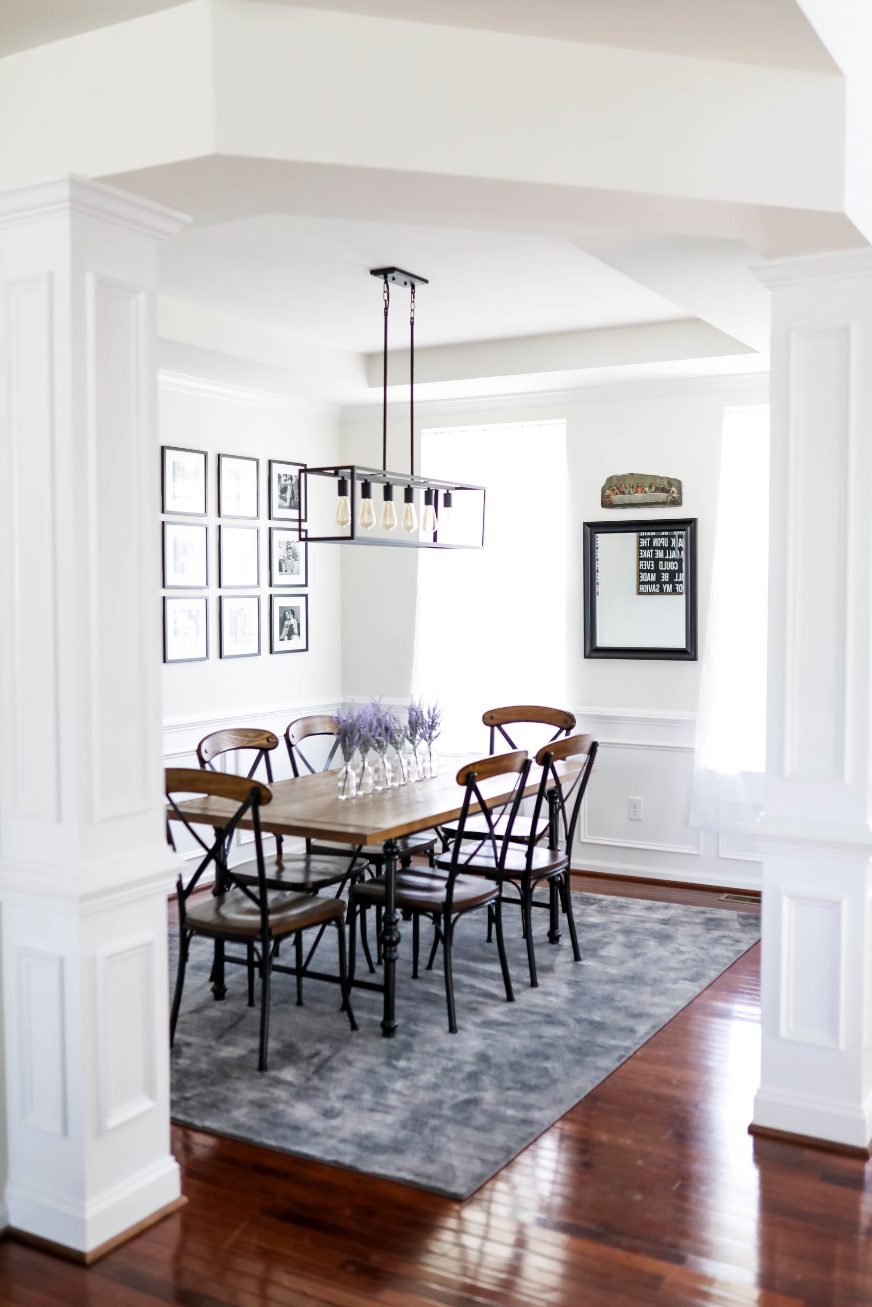


We kept our “old” dining room set from Raymour & Flanigan because it’s held up so well, and I thought the style would still look great in the new space – definitely has that modern farmhouse dining room feel. The was a gift from my bridal shower; the exact piece is unfortunately no longer available on Etsy, but I found a few similar ones , , and !
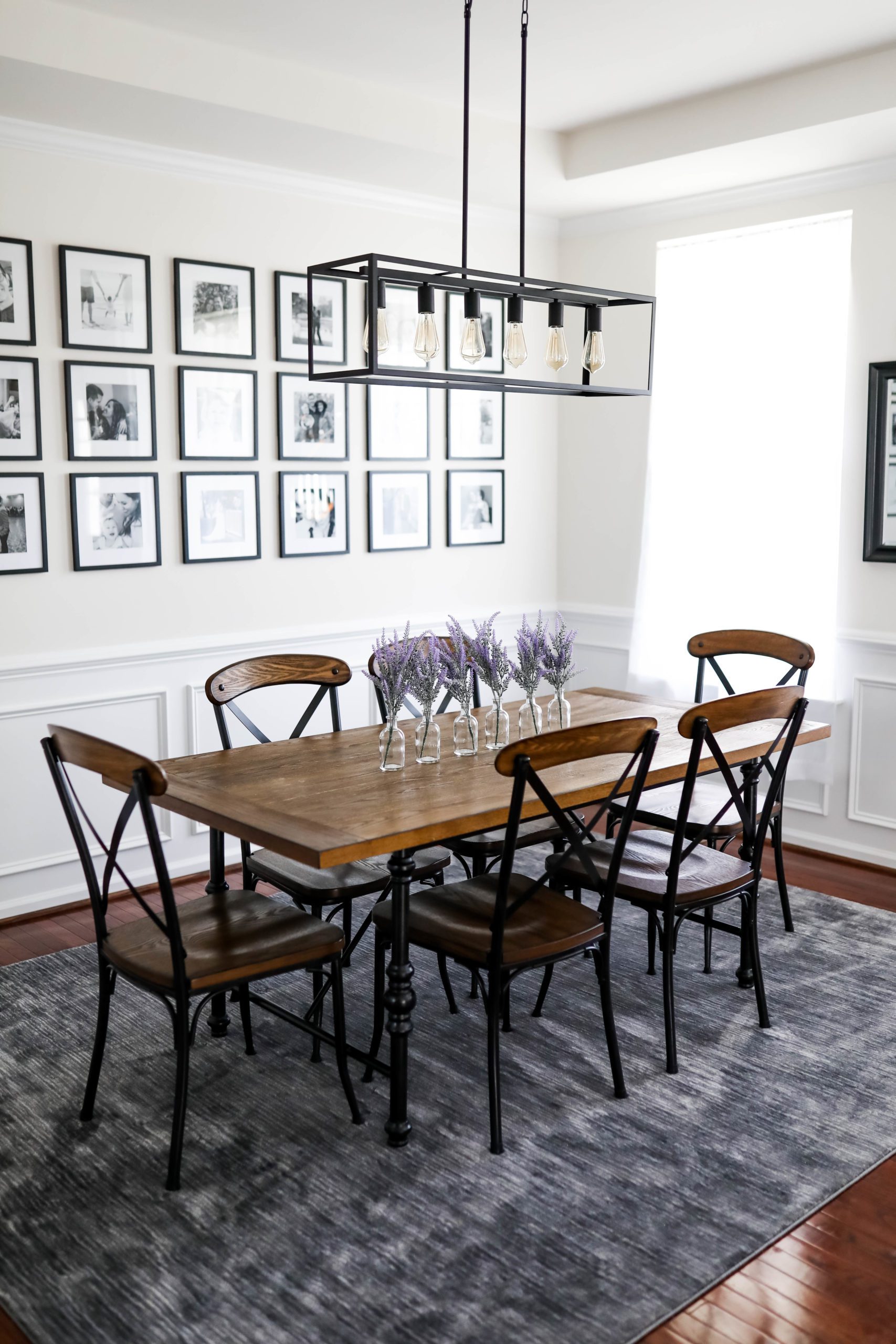

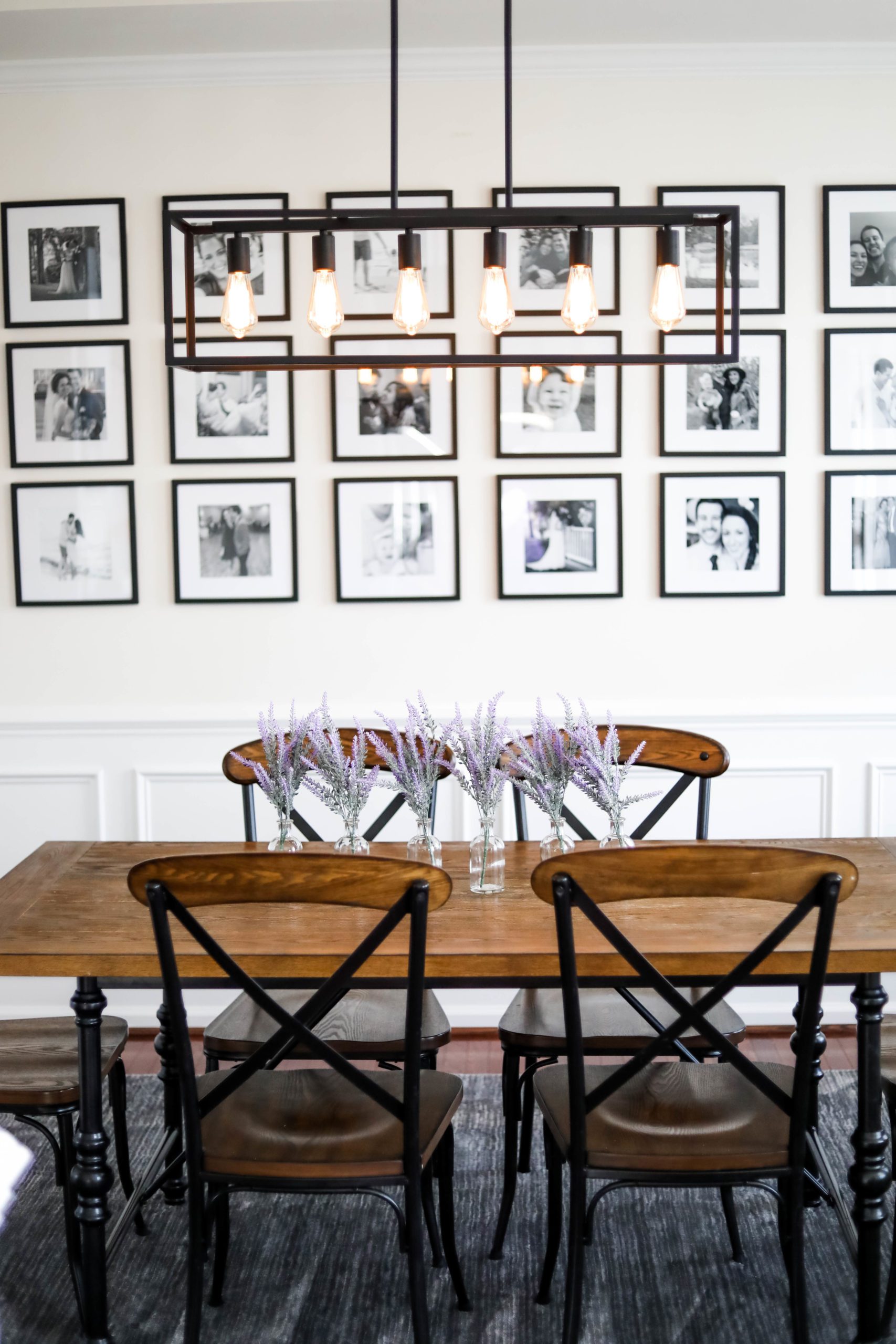
Hands down, my FAVORITE thing in the room is the new . This was something I was envisioning for SO LONG and was collecting photos for in an album on my iPhone for ages. I had seen something similar on Pinterest and just loveloveloved how classic and timeless it felt, and how it captured so much of the essence of family in one space. Especially since the dining room is our familial hub for coming together and breaking bread (literally), I wanted us and guests alike to be able to sit and reminisce on favorite memories and snapshots in time over meals! I bought to make it happen (and ordered three sets – I broke a few frames in the process, WOMP) + got 8×8 black-and-white prints from !
Let’s chat how to measure + make a gallery wall like this happen, shall we?
It’s been my #1 Q from y’all whenever I’ve shared this space on my Instastories, and I totally get why!
…Can I let ya in on a secret?
It’s waaaaay easier than ya think. 😉 All about working smarter, not harder, over here! So I started off by measuring the middle point of the wall going from top to bottom, to know whereabouts that middle row of pictures should be. Once I had that centered, I simply set my level on top and below the centered middle row picture to know how far above and how far below the other rows should be! That way, I wasn’t needing to take a ruler and measure + mark out measurements and numbers…I was simply using my resources and a built-in size guide in the level to make sure things were equidistant AND straight. 😉 Note: The level is about 1.5 inches wide!


A general rule of thumb I learned when sizing dining room rugs is to leave about 24 inches on each side of the table, to account for when folks’ chairs are pulled out. Finding the perfect rug was a STRUGGLE here, namely because I didn’t want anything that would clash or take away from the decor – and we also needed something easily cleanable thanks to a certain toddler running our roost. 😉 I first tried from Target, but it turned out to be too bold of a pattern and distracted from the gallery wall.
So I opted for something more grey that could hopefully pull the different hues in the black-and-white pictures, and THIS one from Amazon was perfect! I was able to grab a matching runner, too, which is in the kitchen, so it feels very put-together now. 🙂 We have this plastic drop cloth then, too, for underneath the chair that hosts Liv’s booster, which is CLUTCH for catching the food she inevitably throws overboard. HIGHLY recommend if you’ve got a baby/toddler, too!!!!
on the windows – I could not lovelovelove them more. They’re the most affordable ones I found but also just PERFECT – we have them on all of the windows on our first floor, actually! They bring such a dreamy, ethereal feel to a room, billow so beautifully in the breeze with an open window, and are still simple and chic.
The mirror was actually something in my old room at my parent’s house that they had saved since it’s a nice, heavy, good quality piece, and it turned out to be PERFECT for this space!
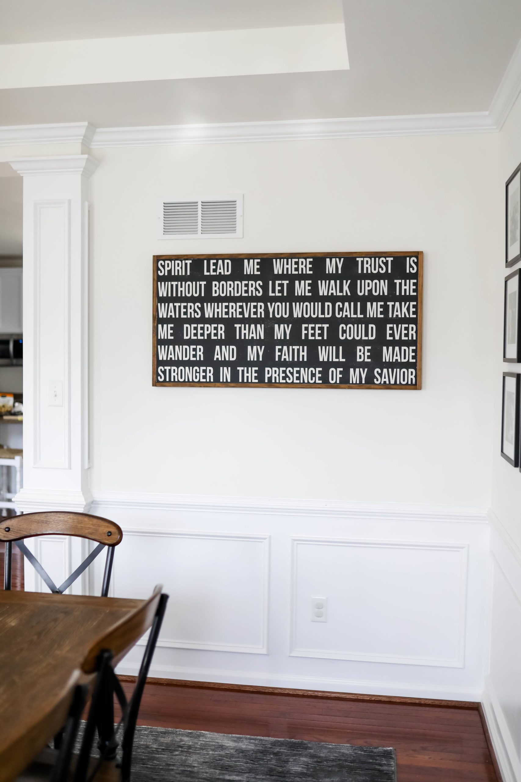
Our Last Supper stone was a find of Jamie’s at a religious retreat and we just lovelovelove it in the dining room over our own table.


I got the idea for the little vases as a centerpiece “runner” from Jen of Sister Studio – she had shared them forever ago and I always thought they just looked so cute lining a rectangular table like that! I threw in faux lavender since I had had it on hand for a photoshoot, but you could take any little floral piece, real or fake, and make it seasonally chic.

Another vibe in our modern farmhouse dining room is the pendant light. I fell in lovelovelove with this style the second I saw it, and was so stoked to find this pendant on Amazon; I ended up grabbing these to play off of it above the island in the kitchen. But the biggest challenge was the lightbulbs.
NOBODY TOLD ME ya need special lightbulbs to get this ~effect~ where you can look AT the lightbulb without basically blinding yourself. 😉 So here we are…I’ve got your back, #YoureWelcome.
We had to get Edison bulbs at a *lower* wattage than what was even recommended for the piece, and that’s what gives you the neat effect of seeing the filaments inside the bulb! It took literally four tries to get the right effect, but we ended up with these!


More new house tour room reveals to come + more home content found here!
Shop everything from our modern farmhouse dining room reveal in the widget below!
Aaaaand that’s about it for our modern farmhouse dining room reveal!
What do you think?? Are you a fan of the modern farmhouse style? What room do you want to see revealed next?